
A Bradford Score Chart turns your attendance records into a clear, actionable metric. It highlights why a handful of short, frequent absences can disrupt your business far more than one single, extended sick leave.
Understanding Bradford Score Chart
Back in the 1980s, UK HR teams needed a way to spot troubling absence patterns quickly. They landed on a simple formula: S² × D. Here, each short absence becomes a scored ripple that managers can track and compare over time.

- S spells: Number of absence instances in 52 weeks
- D days: Total days absent over the same period
- Higher scores flag frequent, short-term absences that need attention
A simple chart maps these scores to action bands—whether that’s an informal chat, a formal review, or something more serious. Small businesses often tweak these thresholds to fit their own culture and size.
Pebble Analogy
Think of each absence like a pebble dropped in a pond. One big splash is noticeable, but it’s the rapid succession of pebbles that keeps the water churning.
Each extra absence spell sends out new ripples, amplifying the overall disruption.
Section Preview
In the coming sections, you’ll learn how to:
- Perform a manual calculation walkthrough step by step
- Use threshold tables to decide when to act
- Apply practical tips for small business implementation
- Automate your reports with LeaveWizard
You’ll start with the history and origins, then dive into the calculation examples. After that, you’ll interpret your scores, understand limitations and legal considerations, and finally see how automation can save you time.
Next Steps
Stay tuned for History And Origins, then move on to Core Concepts and detailed Calculation steps. Your roadmap to mastering absence management awaits!
History And Origins Of Bradford Score Chart
In the early 1980s, HR departments across the UK were staring down ever-rising absence costs. They needed a way to spot not just days off, but the chaos caused by employees clocking in and out on odd days.
An informal formula began circulating—half myth, half practical fix. Some whispered it came from Bradford University, yet the institution has always denied any direct involvement. That air of uncertainty gave the tool almost folklore status as it spread through workplaces.
This formula balances days away with frequency to reveal hidden patterns.
What set it apart was the rolling 52-week window. Managers couldn’t simply wipe the slate clean on New Year’s Day—every absence stayed on record for a full year.
By May 2001, the test case landed in public services. HM Prison Service introduced the chart to 48,000 staff, eager to see if the theory held up in the real world.
Over the next five years, absence rates dropped by a quarter. That 25% reduction turned heads and cemented trust in the method.
At its core, the Bradford Factor uses the formula S² × D. This means ten single-day absences rack up 1000 points, whereas one block of ten days scores just 10 points. Learn more about this curious calculation on Bradford Factor origins on Wikipedia.
Adoption And Impact
By 2006, public sector leaders had hard data and began pairing support measures with trigger bands. Scores below 50 generally prompted a chat, while anything over 500 triggered a formal review.
From manufacturing lines to office floors, companies discovered they were finally reading the real picture—no more hiding in plain sight of simple day counts.
- Early trials cut HM Prison Service absence by 25%
- The 52-week window stopped managers gaming scores
- Trigger bands guided swift, consistent action
As word spread, small businesses developed their own thresholds, shaping bands to fit team size and local policies.
Today, the Bradford Score Chart carries a 40-year legacy, still steering fair and informed absence management across countless UK organisations.
Core Concepts Of Bradford Score Chart
Here, we’ll break down the simple yet powerful formula S² × D that sits at the heart of the Bradford Score Chart. Think of each absence as a pebble dropped into a pond. A single pebble makes a splash—and a few ripples. But many pebbles tossed in one after another create a chaotic ripple effect that disrupts the whole surface.
- S (Spells): Number of separate absence instances, squared
- D (Days): Total days absent over a 52-week rolling period
This setup ensures that lots of short absences score higher than one long absence, highlighting patterns that might otherwise slip under the radar.
For example, ten days off split into five two-day spells will produce a much bigger Bradford Score than a single ten-day block. Managers can spot those frequent blips early and tackle them before they escalate.
Understanding Formula Variables
The first variable, S, counts each absence spell in the rolling 52-week period. Squaring that figure means two spells count four times more than one. Suddenly, frequency becomes more visible than raw duration.
Then there’s D, the total days absent. When you multiply your squared spell count by this number, you scale the duration by how often time off happens. This shines a spotlight on employees whose repeated short absences wreak havoc on schedules.
“Frequent short absences ripple through projects more than single blocked days and deserve fast review.”
— HR Insight
By marrying S² and D, the Bradford Score Chart rewards consistent attendance. A high score flags where repeated absences pose a risk to productivity and where support measures might be needed.
Why Frequency Drives Score
Short, scattered absences stack up faster than one continuous break. Consider a single 10-day absence: it scores 10. Now imagine ten separate one-day spells—each counted individually and squared. That shoots the score up to 1000, an eye-opening difference.
In a small business, catching those high scores quickly means you can:
- Review weekly scores to spot sudden jumps
- Compare figures against set thresholds
- Schedule check-ins with employees whose scores are climbing
Putting this into practice is straightforward: run your analysis after each pay period. Tools like LeaveWizard can automate the maths and reporting, freeing managers to focus on meaningful conversations and real staff wellbeing.
Calculation With Worked Examples
Absence patterns often seem complicated, but the Bradford Score boils everything down to one simple equation: S² × D. We’ll start with basic scenarios and build up, so you can see exactly how each spell affects the final number.
Imagine one continuous spell of seven days off over a year. Plugging in the formula gives:
S = 1 spell, D = 7 days → 1² × 7 = 7. A modest score that barely moves the dial.
Now let’s split that time into three separate two-day spells (total days = 6). That calculation looks like this:
S = 3 spells, D = 6 days → 3² × 6 = 54. You’ll notice how the spike in frequency pushes the score well past early alerts.
Finally, picture five individual one-day absences scattered through your calendar. Here,
S = 5 spells, D = 5 days → 5² × 5 = 125. The tally climbs steeply, underlining how multiple short breaks pack a bigger punch.
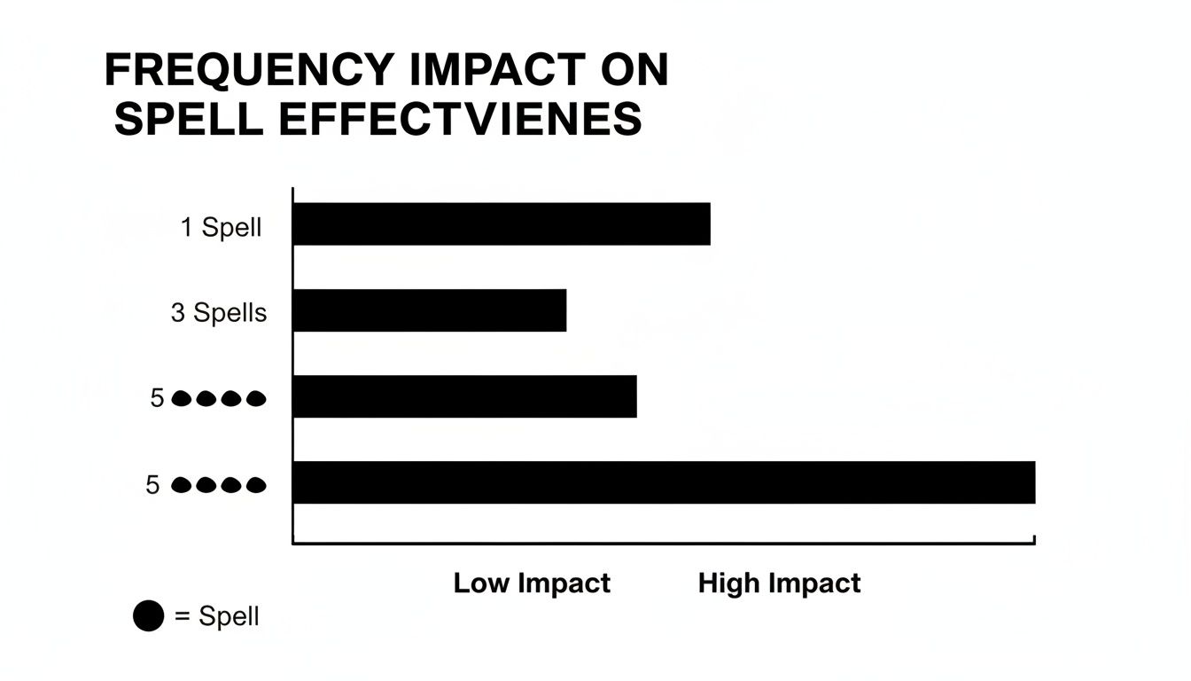
The graphic above makes it clear: three bars with the same length of total days still produce wildly different scores when you change the spell count.
Manual Calculation Steps
Let’s walk through one more example by hand. Think of two spells that add up to nine days off.
- Count the spells: 2, then square that number → 2² = 4
- Multiply by the total days absent: 4 × 9 = 36
A score of 36 sits in a ‘rising pattern’ zone—enough to prompt a friendly catch-up before it grows into something more serious.
Key points to remember:
- Squaring your spell count magnifies the impact of frequency
- Multiplying by total days scales the score to reflect actual time lost
- Even moderate scores merit attention if they signal a trend
“Frequent short absences cause more disruptions than single long spells.”
Worked Examples Of Bradford Score Chart
Below is a quick reference showing a handful of absence patterns and how their scores vary:
| Absence Spells | Total Days Absent | Bradford Score |
|---|---|---|
| 1 | 7 | 7 |
| 3 | 7 | 63 |
| 2 | 9 | 36 |
| 4 | 7 | 112 |
Even a single extra spell or a day here and there can send the Bradford Score soaring. Use this table as a cheat-sheet when you’re eyeballing your own team’s data.
For a complete breakdown of the calculation, check out our guide on Bradford factor calculation.
With these worked examples in your toolkit, you’ll feel confident applying Bradford Score logic manually—or see how software can automate the process for you. In the next section, we’ll explore how to turn these numbers into practical HR actions.
Interpreting Score Chart For Business Action
Turning a series of absence numbers into straightforward steps can feel like finding a map in the dark. For small businesses especially, knowing when to step in with support—and when to escalate—avoids confusion and keeps everyone on the same page.
A clear, visual chart removes guesswork. It sets the stage for consistent conversations and fair treatment, building trust across your team.
Below is a handy guide to the most common bands, matched with practical HR responses.
Bradford Score Chart Thresholds
Use this table as a starting point. You can tweak the ranges to suit your team’s size and rhythm.
| Score Range | Recommended Action |
|---|---|
| 0–49 | No action or positive feedback |
| 50–99 | Informal coaching session |
| 100–199 | Formal warning and review |
| 200–499 | Serious performance review |
| 500+ | Consider dismissal in persistent cases |
These intervals didn’t appear overnight. HR teams in the UK have refined them since the 1980s, testing what really nudges attendance in the right direction. Scores under 50 earn a thumbs-up. Hit 50+, and it’s time for a friendly check-in. Cross 100 and you move into formal territory. By 200, a deeper performance review is due. And beyond 500, you must consider stronger action.
To put it in perspective: for ten days off in one block, you rack up 10 points; spread that across two spells and it jumps to 40; five absences hit 250; ten separate instances rocket to 1,000. HM Prison Service used this method to cut absence by 25%—proof that the numbers can tell a convincing story.

This screenshot shows how those bands translate into real HR dashboards, moving from casual mentions to formal warnings as scores climb.
Customising Thresholds For Your Business
Every company has its own heartbeat. A lean start-up won’t treat absence the same way a factory with shift teams does. To make these bands your own:
• Review your historical absence patterns with managers.
• Match each band to your culture—what feels fair and proportionate?
• Pilot adjusted thresholds over three to six months and fine-tune based on feedback.
Tailored triggers ensure your approach stays relevant and respected.
Conducting Empathetic Review Conversations
A number on a screen shouldn’t feel like a threat. When someone crosses a threshold, start with genuine curiosity:
“I’ve noticed you’ve been off on three occasions this quarter. What’s been going on for you?”
This question opens a dialogue rather than a lecture. It shows you care about their well-being, not just the figures. Listen actively and explore any underlying issues before jumping to conclusions.
Ensuring Fair Process Under UK Law
Work within transparent procedures and you’ll stay compliant with the Equality Act and other regulations. Always:
• Document every step in writing.
• Offer reasonable adjustments where needed.
• Keep the employee informed about next stages.
For a deeper dive into turning absence data into proactive policies, check out our guide on what your data can tell you about leave and absence.
Leveraging Automation With LeaveWizard
Manual spreadsheets are a headache and open to mistakes. A platform like LeaveWizard plugs into your payroll and leave records, automating score calculations and reports in seconds.
• Instant alerts when someone nears a trigger band
• Custom dashboards to visualise real-time trends
• Automated reminders for managers and employees
This level of automation can cut admin time by 40%, freeing you up to focus on coaching and support instead of crunching numbers.
Monitoring Trends Over Time
A single spike in absence might be a blip—or the start of a pattern. To spot early warning signs:
• Review scores weekly or monthly, using a rolling 52-week window
• Chart department-level scores to identify hotspots
• Plot trends on a simple line graph for quick visual insights
These steps help you catch team-wide stress or seasonal dips before they become bigger issues.
Common Misconceptions And Limitations
Picture a manager peering at the Bradford Score Chart and assuming it’s a punishment meter. In truth, it’s a diagnostic tool—designed to highlight recurring absence patterns, not to penalise someone for an occasional genuine illness.
Others worry it doesn’t account for part-time shifts or flexible hours. The good news is you can apply a simple pro-rata adjustment to keep comparisons fair across all working arrangements.
Misinterpretation Risks
It’s easy to fall into these traps when you first work with Bradford scores:
- Punishment for Illness: High scores don’t necessarily mean misconduct; they signal a pattern worth reviewing.
- Overlooking Valid Absences: Chronic conditions and disabilities are not ignored if you factor in reasonable adjustments.
- Encouraging Presenteeism: Fear that employees will come in sick to dodge points—this is exactly why context matters.
| Misconception | Reality |
|---|---|
| Score Equals Blame | Flags attendance patterns, not intentions |
| One Rule Fits Every Role | Part-time and remote work can be pro-rated |
| High Score Demands Firing | Triggers supportive reviews, not automatic dismissal |
These myths can quickly erode trust if left unchallenged.
Under the Equality Act, employers must provide reasonable adjustments for disabilities. Overlooking this opens both ethical and legal pitfalls.
“Using Bradford scores without context can breach ethical and legal standards.”
Pair the chart with supportive absence policies—like flexible working or phased returns—and you foster real transparency and care.
When a local café owner noticed rising scores, she added casual back-to-work chats alongside clear threshold levels. The result? Stronger relationships and far fewer unexplained absences.
Implement Responsibly
Follow these steps to keep your process fair and human:
- Review scores alongside medical notes.
- Offer adjustments under the Equality Act.
- Combine data with open conversations before any formal action.
Check out our guide on Bradford Factor trigger points for small businesses.
Even the most robust chart can’t capture every personal circumstance or mental-health break. Treat scores as a conversation starter, not a final judgement.
When empathy meets data, the Bradford Score Chart transforms into a genuine support tool.
Legal And Ethical Considerations
Absence scores involve sensitive personal data and privacy laws. Transparency about why you collect scores—and how you use them—protects trust and ensures compliance.
Always document your policy rationale and share it with staff. Openness like this aligns with the Equality Act and data-protection regulations.
- Conduct regular policy reviews to spot potential bias.
- Include employee representatives in absence-management discussions.
Used thoughtfully, absence scoring can reinforce fair, compassionate attendance practices across your organisation.
FAQ
How often should I calculate scores?
For best results, update your data weekly. That rhythm is quick enough to spot emerging patterns without drowning your HR team in admin.
What data do I need for a Bradford Score Chart?
You’ll want to log every absence spell—date and duration—over a rolling 52-week period for each person.
How do I adjust for part-time staff?
Simply scale the D variable to reflect contracted hours, or apply a pro-rata window. That way, part-timers and full-timers stay on a level playing field.
What software can automate this?
A growing number of HR platforms include a Bradford Factor module out of the box. Alternatively, you can lean on a robust spreadsheet template with pre-built formulas.
Troubleshooting Common Questions
- Check that all absence dates and day counts are entered correctly.
- Make sure part-time pro-rata calculations align with each contract.
- Automate the update process to minimise manual errors.
“Automating the Bradford score chart calculation saves HR teams an average of 40% time.” — HR Professional
When To Seek Help
If you spot a sudden spike in scores, get managers involved right away. A brief check-in can reveal health or wellbeing issues.
When patterns look complex or worrying, consider an absence review meeting before moving to formal warnings.
Key Data Points
- S variable: number of absence spells
- D variable: total days off
- A reliable spreadsheet or HR software
Keep everything refreshed weekly for an accurate 52-week view. This FAQ is your toolkit for rolling out the Bradford score chart confidently.
Can I reset scores after a year?
There’s no need to manually reset. A rolling 52-week window does it for you, always keeping the chart up to date.
Can I use the chart to benchmark teams?
Definitely. Line up department scores side by side to spot hotspots and channel resources where they’re needed most.
What are common pitfalls?
Don’t assume a high score means abuse. Always pair the data with context and empathy.
How do I communicate thresholds to my team?
Bring clear charts into team meetings and tuck them into your employee handbook.
Getting Started
- Gather attendance records from the last 52 weeks.
- Define trigger bands that fit your business size and culture.
- Train managers to run weekly checks and hold supportive conversations.
- Plug in LeaveWizard to automate these steps and bring trends to life.
Ready to simplify absence reporting? Use the Bradford score chart features in LeaveWizard—start today at the LeaveWizard website.


